Homepage
Before

After

UX Redesign
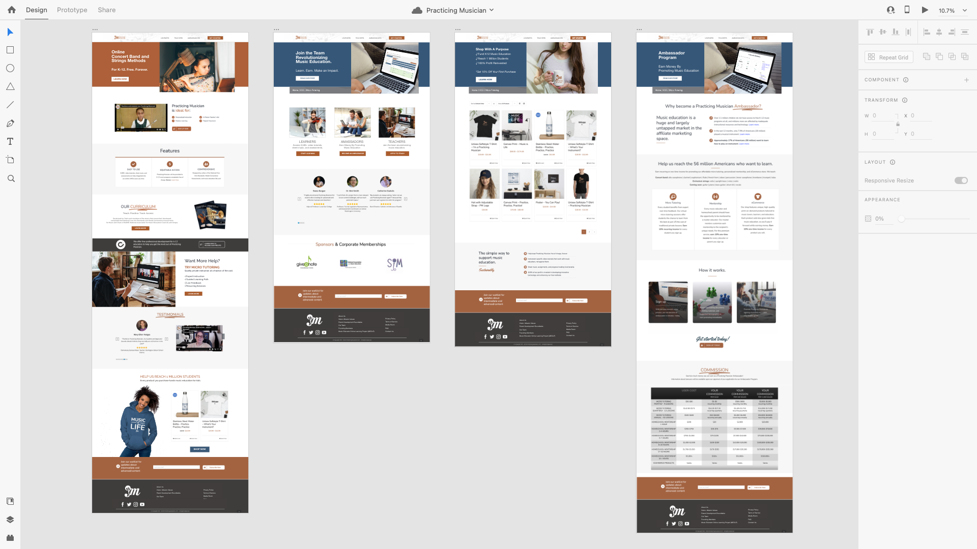
As this was only a UX/UI design, I wanted to make a quick mockup, re-using the components that were there. I didn;t want to rebrand it and create new assets. As I compiled components (screenshots and product images mostly), I began to identify the top-line business items, and had enough collateral to include more screens, individually exported in the gallery below.

Global Header
Before

After


