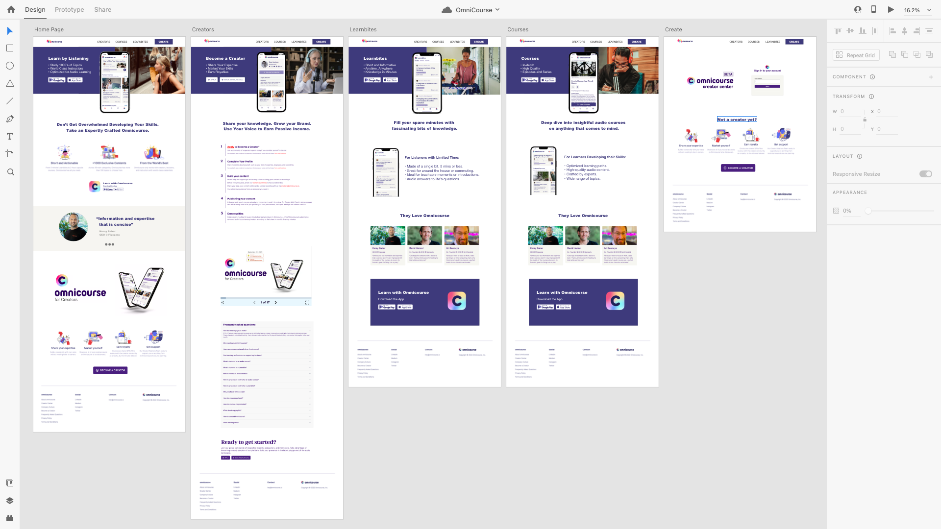
Hompage
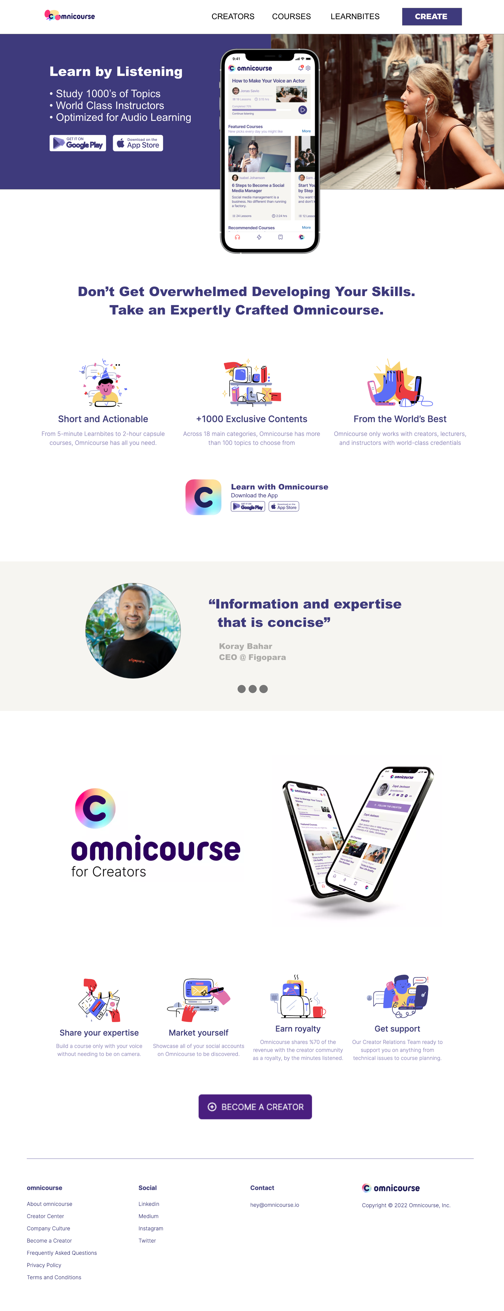
The before and after home page. The copy is leaner and more concise. The layout is focused with calls to action for two types of users, listeners and creators. Products are differentiated. Narrative images help convey the message. More product images were surfaced.
Before
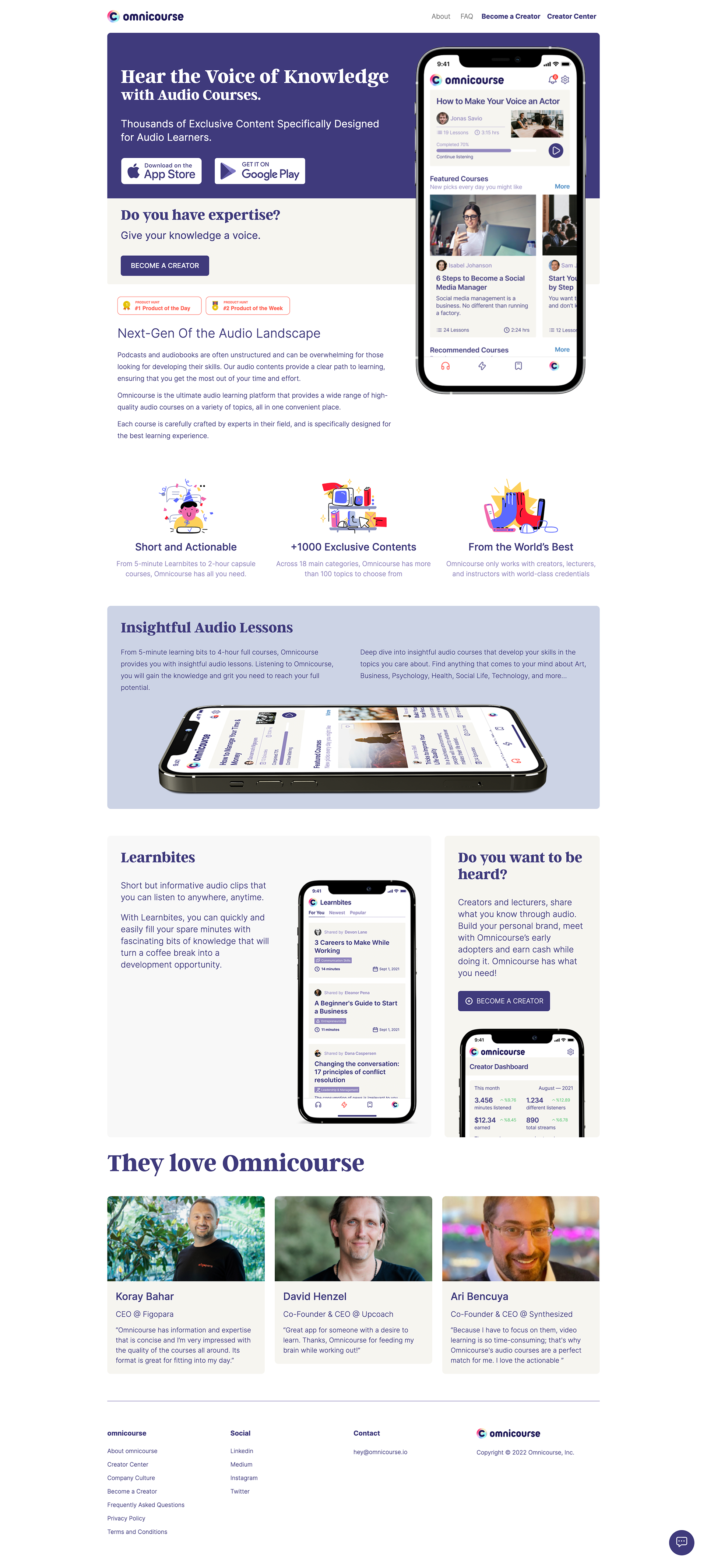
After
KnowCap.io uses Web3 Clarity.so for Tasks and Doc Management with Crypto Backed Permissions
I completed this UX/UI redesign task to explore the KnowCap.io DAO that partners with minority founders and their early stage startups.
The DAO uses Clarity.so, a Web3 native docs and tasks, collaboration and contribution app for decentralized teams. The app uses Sign-in with Ethereum and token-based permissions. I'm very interested in blockchain and crypto.
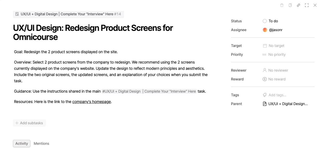
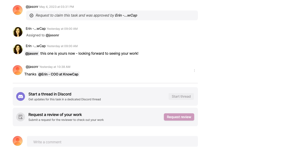
The task (below) is from KnowCap's "starting block" on Clarity.so, but looks similar to any task or ticket on another app. It's assigned to me and has instructions to redesign 2 product screens.
As this was only a UX/UI design, I wanted to make a quick mockup, re-using the components that were there. I didn't want to rebrand it and create new assets. As I compiled components (screenshots and product images mostly), I began to identify the top-line business items, and had enough collateral to include more screens, individually exported in the gallery below.
Using Adobe XD to Quickly Optimize the Layouts
